Farmacy
Brand Identity • Print • Illustration
The challenge:
Create a welcoming vegan restaurant identity that balances elegance with accessibility.
Role: brand identity, illustration, collateral design
The story:
Farmacy was conceived as a vegan restaurant focused on bringing approachable, health-conscious dining options to an underserved market. The brand needed to feel modern and elevated while maintaining warmth and accessibility. The visual identity was built around elegance and simplicity, while preserving a welcoming, food-centered personality.
Visual Direction:
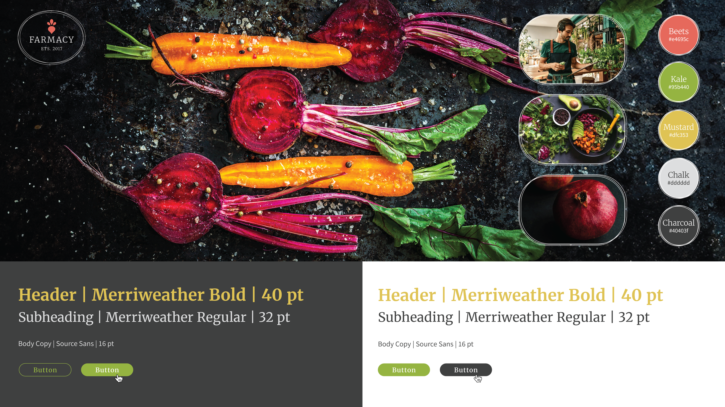
The visual system emphasized overhead food photography against dark backgrounds, allowing vibrant ingredients and color accents to become focal points. Bright colors evoke freshness and energy, while charcoal and chalk-inspired tones reference menu boards and handcrafted food experiences. The logo was designed to remain flexible across applications and backgrounds. The design elements extended through oval forms and the repetition of the beet imagery that reinforced the playful, modern personality of the brand while maintaining clarity across applications.




Print Collateral:
Business cards extended the visual identity through restrained typography and subtle spot-gloss texture, reinforcing the brand's balance of refinement and approachability.
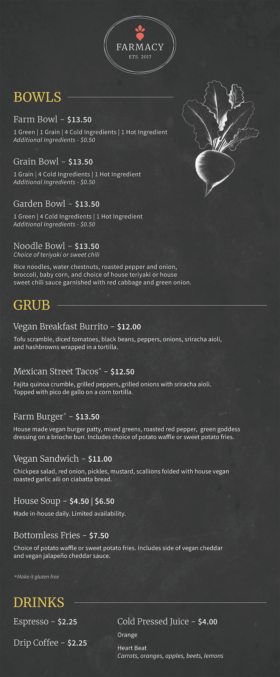
The menu drew inspiration from handwritten chalkboard menus. It incorporated the hand drawn version of the beet motif to emphasize the personalized, hand-crafted personality of the restaurant.